Greetings, Loyal Reader!
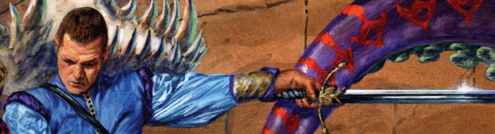
Three artists have provided cover illustrations for the Jason Cosmo books published to date. For the U.S. editions, the Jason Cosmo and Royal Chaos covers were painted by noted fantasy artist Richard Hescox. I love these covers! Let’s look at the Jason Cosmo cover:

Once you’ve read the book you know that this depicts Jason Cosmo, Mercury Boltblaster and Sapphrina and Rubis striking a pose with a stack defeated foes: the Red Huntsman, Yezgar, an iron butterfly, and the Jaws of Death. There is also a scary toad creature (which Merc appears to be standing on) under the purple dragon’s neck. Hard to see on this scan.
Now this is not quite exactly how I pictured these characters when I was writing the book, but I understand that each reader’s mental image may vary … and I love how Mr. Hescox captured the spirit and flavor of the story. You don’t get the standard issue dramatic pose or fight scene here. It is more like a posed publicity shot. I mean, the dragon is clearly only playing dead, with his tongue hanging out like that.
I imagine it went something like this: “Hey, could we get you bad guys to lie there and play dead … that’s it! Mr. Boltblaster, if you would stand on the frog and maybe hold your hands out like you’re doing some magic … perfect! Mr. Cosmo, could you hop up on that rock? Great! And we’ll put the girls over here! Lovely! Dragon, hold still! You’re supposed to be dead!”
I appreciate that the artist obviously read the whole book and got that is supposed to be ridiculous and even painted in a giant soda can. And not just any brand of soda, but Sola-Cola!
I assume that caused a few double-takes on the fantasy aisle at the local bookshop. But I don’t really know. Let me explain:
I remember my own excitement when I first saw this cover. But I had the advantage and disadvantage of being the author and thus knowing the whole story. Advantage, because I knew who all these characters were and could appreciate the subtle humor of this scene. Disadvantage, because book covers are mainly intended to be viewed by, and attract the interest of, people who don’t know the story at all. The point of the cover illustration is to make you want to pick up the book, maybe thumb through it, hopefully buy it, and ultimately read it.
Did this cover succeed in that mission? As Your Author, I can’t say. But I would be interested to hear from Loyal Readers like you. What intrigued you enough about Jason Cosmo to pick it up? Did this cover image intrigue you, amuse you or confuse you before you read the book? If anyone can recall your first impressions, please share.
(If you read the UK edition published by Pan Books, feel free to chime in too. I’ll discuss that awesome Josh Kirby cover another time.)
I ask not merely for my own curiosity, but because it will soon be time to design the cover of Jason Cosmo: Hero Wanted. So beyond this particular cover, I very much want to know your thoughts on book covers in general, and fantasy book covers in particular: What do you like? What do you hate? What has been done to death? What cover clichés or mistakes should be avoided (or, more likely, mocked)? What are your favorite covers of all time? What are the worst covers? Favorite artists?
Do let me know …
Best regards,
Dan McGirt

Cool. I just reread my original first edition, and found this spiffy new site when I started wondering if Dan McGirt ever wrote anything else.
I have to say, Jason Cosmo holds up pretty well. Except for the mesh shirts and the Vuarnet sunglasses. And the constant pining for Debbie Gibson. And, well, Boltblaster’s Flock of Seagull’s haircut.
I hope the update has Erimandrus having an emo haircut and whining about how his parents don’t understand him. Maybe Mercury can have some sort of magic communication device like an iBall or something, and make mention that his flying carpet is a “hybrid.”
Anyway, really good job on Jason Cosmo. I enjoyed it when it first came out, and I enjoyed it again here in the future.
Geez, I forgot to answer the question. The current cover is good, though the soda can really is over the top and the iron butterfly doesn’t look metallic.
I think colons in titles are always a bad idea.
I always liked Rowena back in the day, and Jim Burns. I have no idea who is good these days for novel work.
I worked with Brian DeSpain for a while, he’s very good. He’s done some work for the WoW card game.
http://despainart.com/index.php